This story is from The Labelmaker – Wine Label Designs Since 1998
The Labelmaker is a creative, professional graphic design firm with a focus on wine label designs and strategic brand solutions for the wine, spirits and beer industries. Our services include custom lettering & calligraphy, packaging design, logo design, name generation, brand identity, signage, wine and spirits bottle photography.
The Project
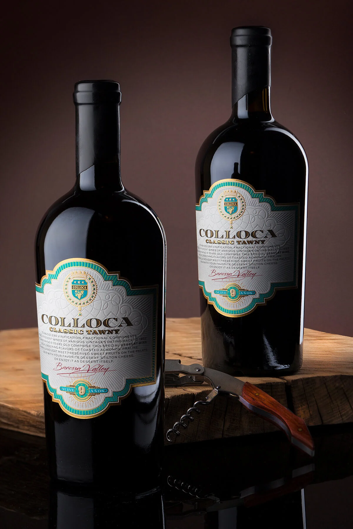
Colloca Classic Tawny is the latest exotic addition to the growing Colloca Estate portfolio. It is a very rich and tasteful blend of 55 different wines also from different vintages which makes it very special. My goal was somehow to reflect this unique richness of taste with my label. This is why I was absolutely decided to create a vintage label design with an abundance of details that carried the spirit of this classic tawny.
The Challenge
I had just designed the wine labels for Colloca NY wines and I was still impressed by the final result. Two weeks later I had to create a new design for the Colloca Tawny.
Looking at the newly designed wine labels I knew I had to do something even more impressive but also different because I did not want to compete them. Time was really short for this new projects so I was somehow challenged to act really fast to create brand new premium design for Colloca Classic Tawny.
The Result
I was deeply influenced by the different vintage designs for cigar boxes, very old and even naive port labels with stencil typography but I also had very romantic feeling about creating different levels of detail in my work by using a variety of embellishments. So all these elements lived as a special art mixture and fermented in a slow creative process until the moment I started this vintage label design.
I personally love engraved typography so I together with my type-mate Vassil designed a special typeface for COLLOCA branding featuring engraving effect. I also wanted somehow to create more interesting and appealing background and I this is why I used the very unique Moonlight paper by Arconvert. I designed a linear radial pattern that was hot-pressed and created amazing debossing effect. I was also surprised to discover that the debossed part of this incredible paper looked semi-transparent which enhanced the play between dull and raised parts even more.
Some of the elements unlike the background pattern were embossed which significantly improved the 3D feeling of the label surface.
I also used warm gold to make the label look rich and attractive. My final touch was creating an unique shape of a banderole which made the whole vintage label design even more attractive. Bottle sealing is made with cork and black sealing wax. We used shorter tapered bottle with very solid even masculine presence.
I think as a result we received very classy vintage label design, rich of different details, yet with excellent legibility and appealing authentic look. Perfect reflection of the amazing rich & complex taste of Colloca Classic Tawny
Credits:
Client: Colloca Estate Winery
Wine Label Designer: Jordan Jelev
Paper: Moonlight by Arconvert
Print: Daga Printing House

